Tuesday, August 4, 2009

Statistical Map


This map shows the percent change in metropolitan area population for the United States.

Image source: http://www.census.gov/popest/ gallery/maps/map_20002005.jpg

Monday, August 3, 2009

Cartogram


A cartogram is a map where a thematic variable is substituted for land area. In this map, the election results are mapped with area distorted to show strengths for either side.

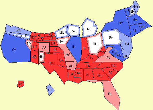
Image Source: http://www.electoral-vote.com/evp2007/Pres/Carto/Dec27-c.png

Flow Map


A flow map shows the movement of objects from one place to another. This flow map shows total combined truck flows for Texas...as it relates to the continental U.S.

Image Source: http://www.lib.utexas.edu/maps/ texas/combtrk_tx_1998.jpg

Isoline Map


This isoline map shows average temperature across the United States from March 18-24 2001. An isoline map joins points of the same value, where in this map, the lines connect points of equal temperature.

Image Source: http://www.learner.org/jnorth/images/ graphics/u-z/weather_isotherm032401.gif

Proportional Circle Map


This map shows the Filipino population of some selected states for the year 2000. The larger the circle, the greater the Filipino population in the given state.

Image Source: http://www.neiu.edu/~ambarda/ proportional_circle.jpg

Choropleth Map


This map categorizes each state according to the attribute of freshwater use per day in the United States.

Image Source: http://water.usgs.gov/ watuse/graphics/domap.st2.color.gif

Sunday, July 5, 2009

Remote Sensing


This is a aerial IKONOS photo taken of an area in China. This image and data were used for research by the owner of them.

Data Source: http://ecotope.org/aem/sites/yiyang/kml/yiyang_2002_images.kml